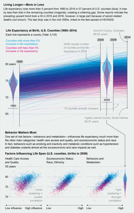
Life expectancy is a simple number, but the reality is complex. In general, life expectancy in the US has grown by about 5% since 1980, from 73.8 years to 79.1 years. That is not the highest in the world, but it is a good trend. The reality is more diverse. The county with the highest life expectancy was 86.8 years in Colorado. The county with the lowest life expectancy was in South Dakota with 66.8 years. That’s a twenty year difference based on where people live. Thirteen counties actually saw it drop. While it seems simple to point to the quality of healthcare available, the stronger determinants were wealth and activity. Wealth has been reported elsewhere; but activity levels are the strongest influence. The bad news is that there is a disparity. The good news is that changing something as simple as personal choices like activity levels are available to almost everyone. Local culture plays a role, as does wealth; but at least individuals can decide to go for a walk or exercise as long as they can challenge local norms. (On a personal note, it looks like a good day for a walk today, and maybe a bike ride tomorrow.)
“Life Expectancy Is Rising Disproportionately Across The US” – Scientific American

Thanks for sharing this and other odd-ball stuff that makes me laugh, or cry or think deeper. This one is rethink deeper.
LikeLike
Pingback: Data That Matters May 2018 | Pretending Not To Panic
Pingback: American Life Expectancy Drops | Pretending Not To Panic